Showing posts with label original work. Show all posts

12/4/12

Printed: Ahoy It's A Boy!

IMGP4690
IMGP4696IMGP4699IMGP4697 IMGP4704

A couple of months ago and a whopping four months after Felix was born, I finally got around to sending out some proper birth announcements. I try  to be good with thank-you notes because they serve as a moment to slow down and take the time to be grateful and thoughtful of those who are good to you. 

I'm usually very good about getting my stationery out speedily because I believe that part of the thank-you is acknowledging the act of kindness when it actually happened. I was super happy when we went on our honeymoon (we took a train all the way across the country to Vancouver) and we were able to write our wedding thank-yous en route just days after the big day. It was especially nice because it felt like the final chapter to five months of busy planning and wedding talk but even more importantly because we still had all of the love and generosity of our families and friends fresh in our mind. Being in awe of how much everyone loves you is great inspiration for a stack of fresh cards. Half-way through our trip we landed in Winnipeg and found the central post office which turned out to have a special stamp (used only at that particular post-office) and the guy behind the counter hand-cancelled every single note for us. This is heaven for me! I felt pretty awesome that our thank-yous got to their recipients even before we got back from our trip. 

But then there were the baby announcements. I know these aren't technically thank-you notes but for whatever reason in MY mind, sending these out felt like a final, official note of love for everyone who had been so supportive and thoughtful throughout our pregnancy and during those early months of our baby-dom. 

The only problem was I had a baby. 
A baby but no time. 

No time until one night when I woke up at three in the morning and couldn't sleep and like lightning had a burst of energy and inspiration. Two and a half hours later I was looking at these guys and tweaking the type. Giving away pre-dawn sleep when your baby is snoozing is a big deal around these parts so I'm certainly glad I had something to show for my effort.

I love how they turned out. I wanted something simple and traditional and landed on the nautical theme while I was still in bed, pretending I might be able to get back to sleep. I had been toying with a completely different design for a couple of months (thinking of a green and yellow colour combination) but could never figure out how I was going to tie everything together. When I thought of the little sail boat as the focal point, the rest of the look and colours just clicked. I hope that they do justice to a boy that is so sweet and lovely. He deserves some good stationery and you better bet he'll get some lessons about sending out some mail.


8/1/12

Written Work: Vive Magazine


I've been so caught up in babyland that I failed to mention my latest published work - a piece for the online fashion magazine Vive.
Check out the newest issue Vive Magazine to read my piece entitled "Pursuit of Perfection: Separate the good stress from the bad." Find it on pages 22-23!

I had such a blast putting this piece together (it includes some pointers on how to deal with mounting stresses, professional goals and those nagging voices in your head) because I know, firsthand, how difficult it can be to feel like you've got a handle on everything.
I am my own worst critic and can let my feelings of inadequacy rob me of precious sleep and leave me with nothing but anxiety. I've been struggling for the past two years to figure out where I want to go professionally and how to combine creativity with, ahem, a viable job. I've been taking classes, my end goal has changed a few times and I've come back to one of the things I thought I had stepped away from but can't escape: my need to write.
Oh and somewhere in there I got married and decided that a family was going to happen alongside everything else.

It's hard. We have a stricter budget now that I am on maternity leave so balancing that has been tricky. And while I've got all these ideas in my head for new things, my baby boy is such a huge priority right now. He deserves all of me. He's so small at just nine weeks (even though he is chunking up - almost thirteen pounds!). I am tying to keep a handle on this new motherhood thing and balance it with that person inside me that still wants creative challenges around. I don't think it's one or the other - being a mother has made me value time so much more so when I do manage to sit down to work (which doesn't happen as often as I like) I am at least, way more efficient about it since it is precious time away from my little man. 

I hope to keep the energy going because I do have some plans!
New articles I want to write, stories that need to get told, even some ideas for some original prints - all lingering in my head somewhere.

Follow Vive on Twitter and on Tumblr.

4/10/12

Written Work: Kinfolk Magazine Vol.3


I finally received my copy of Kinfolk magazine Vol. 3 and just as suspected, it is superb.
Everything from the paper to the photography to the layout is so thoughtfully executed and I'm so thrilled to have contributed a written piece for this issue.

Find me on page 35 where I discuss how my husband and I revisit the places that became sacred to us during our courting period - when we were just getting to know each other and fall in love. Working on the piece made me realize how important the simple traditions are for us as a couple and for our future as a family. Soon there will be three of us and I can't wait to keep building on our special spots.


Buy your copy here.
iPad Version here.

The images above are mine but the beautiful photography for the piece was contributed by Celine Kim.
Congrats (and thanks!) to Nathan and Amanda Jane who always inspire with their work and really know how to put it all together.

2/26/12

Letterpress: The Berkeley Suite


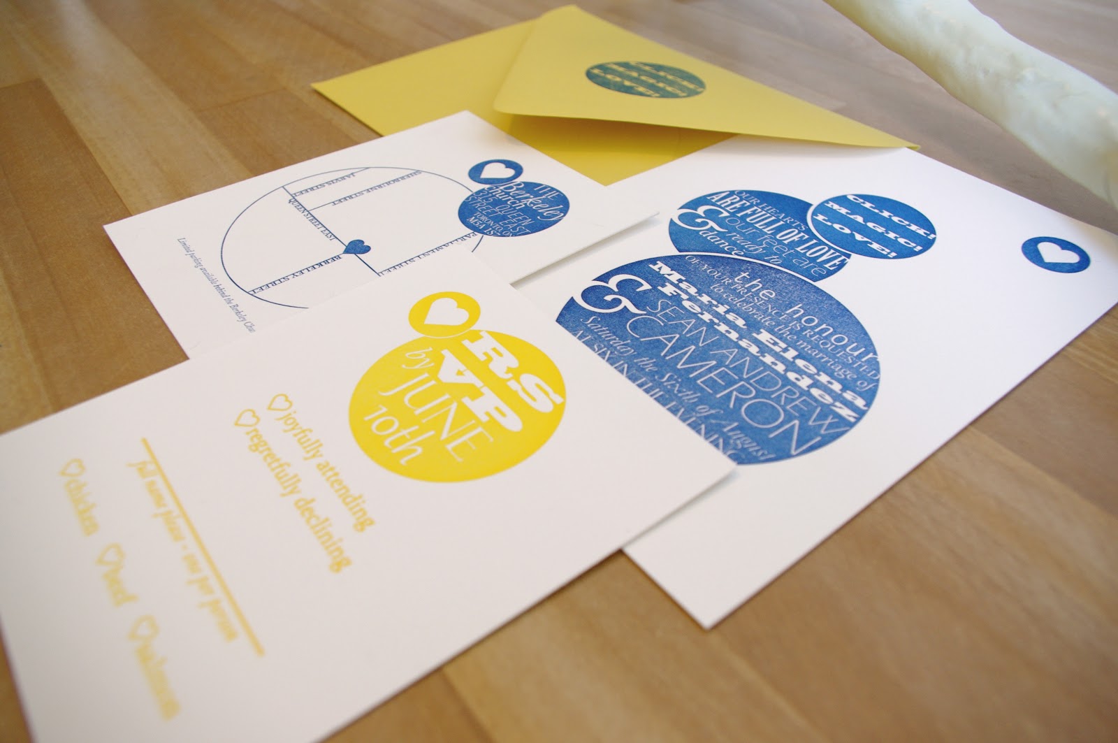
My sister got married at the end of this past summer and Chris and I gifted them a custom, letterpress invitation suite for their special day. The venue was an old church, built in 1871, that has now been converted into a hip venue space. I was given free reign for the design and because the venue was so unusual I decided to something outside of what is typical for wedding suites. My sister had mentioned that she liked carnival-era posters with a heavy focus on a combination of different types of font. I played around with designs for a bit before landing on the idea of building everything around the circular design. I wanted it to be interesting but also clean and modern.

I worked with Snap and Tumble for the letterpress portion of the invites. Tanya was extremely patient during the whole process - in total the printing took 10 hrs (!). Each of the 120+ invites had to go through the press five times and that's not counting the designs on the envelopes and the reply envelopes (not shown) that had the bride and groom's return address. The colours were hand-inked and the registration was all done by hand on the letterpress.

It was a huge project but I was pretty happy with how everything turned out. I love that the invitations communicated the individual style of the day and the fun nature of the couple.

Custom Letterpress Wedding Invitations: MF Miller
Letterpress Rental: Snap and Tumble

12/31/11

Sneak Peek: Christmas Cards - The Watercolour Edition


Stage two of the Christmas card project.
I decided on doing a sort of abstract Christmas tree in a variety of colours because why stick to red and green when you have a palette of shades.

12/29/11

Sneak Peek: Christmas Cards!


 I want to share some of the Christmas cards that we mailed out last week. I'm not going to get into how busy the last few weeks have been because, well, hasn't everyone in the world been swamped for the last month? But I managed to sit down and spend some time on some crafty cards and I was pretty happy with the results. 


They took the better part of a Sunday but it was really nice to just sit quietly and work on something with my hands. Initially, Chris and I had discussed drawing something and then silkscreening all the cards. But of course, the weeks got away from us and since I don't have the proper silkscreening emulsions, I couldn't really print them up at home. I decided instead, to use the things I had on hand: my typewriter, some watercolours and some thick cardstock. Above is the first stage of creation - I typed a simple message on each (nearly 30 of them!) and even remembered to make some of them bilingual! 


12/4/11

Written Work: Uppercase Magazine and Lizz Aston


Not quite sure how it happened but I've forgotten to mention this exciting bit of news. The last little while has been rather busy/crazy/exhausting as my pathetic blogging habits demonstrate, I'm sure.


Uppercase Magazine, an independent publication for which I have great respect, published an article that I wrote about an amazing textile artist and crafter, Lizz Aston. The issue is out now and available either online or at fine retailers.


It was incredibly exciting to put the whole project together and rather surreal to see my name printed in an official capacity. Knowing that Uppercase considers themselves the magazine for "the creative and curious," I knew that I wanted to be a part of it, somehow. I met Aston through a silkscreening class she teaches at the Harbourfront Centre. The first night of class, she showed me her professional work and I was completely blown away! Sometime after the course finished, something clicked in my head and it dawned on me that her work would be a great fit for the magazine. I'll feature some detail shots of Aston's work tomorrow, so stay tuned.


I should also mention that I could not have put together such a cool feature without the awesome photography skills and professional knowledge of Natasha Bardin. We all had such a ball bringing the shoot together.


Lizz Aston, blog
Natasha Bardin Photography
Uppercase Magazine, blog

10/14/11

Open For Business


I'm live.
In the last few weeks I've spent a lot of time working on my professional website.
After much self-exploration (sorry if that sounds rather flaky) I've really zeroed in on what I want to devote my efforts to - and what I want my life to look like. After graduating from a very traditional institution and saying no to the traditional follow-up of grad school -  I was reluctant to get back to writing because when you've been writing long academic papers for years, you can get kind of "over" it.


I started taking printing classes like mad just because I liked it. Somewhere in there a few light bulbs went off and I got some ideas for things I would like to write. 
Things I'd like to read.


And that's what I've been doing lately.
I've been submitting ideas, writing articles and stories, editing said articles and stories, selecting images and finally taking photos of my printed work (because as much as I am a writer - I'm also incredibly visual and want to continue designing).


It's been really exciting to figure out exactly how I want my life to look and to just do it.
So come on by and get in touch if there's something you'd like discuss...
I'm open for business!


9/20/11

Letterpress Business Cards - Cambie Design


A few months ago, I had the supreme pleasure of whipping up some custom business cards for a great friend of mine. She left to go out east for the summer, working her creative design magic on a wonderful hostel, Skerwink Hostel, in Trinity Bay, Newfoundland. The hostel is geared at a younger crowd but that didn't mean the owners wanted juvenile interiors. They commissioned Cambie Design to bring together a look that was thoughtful and whimsical while staying true to its coastal location.
I have been watching the projects develop all summer - you can check them out here! It's been such a treat to see Camille's creativity keep growing. She constantly surprises me with her fresh and clever ideas.

The blind impression
Hand-mixed ink
The inspiration

But back to the beginning of June. I worked on the cards above one night, literally between work and getting ready to leave town for one week. It was a bit of a rush job because I wanted the plates (for the printing) to be on their way for processing before my vacation so I could come back and print them on the last day I had off before Camille left town. After some brain-storming we ended up landing on the idea of doing a blind (no ink) impression on one side and her contact info on the other side, done in a pale grey, which was actually inspired by an Essie nailcolour we both bought at the same time in different  cities (weird, right?). I spent an afternoon printing them over at Snap & Tumble's lovely studio. I think they came out beautifully. Simple, chic and I like to think quite special.

Camille tweaked the backs with hand-applied watercolour. She's that good!

8/26/11

Mail Out


Here are a few things I mailed out last week.
It's pretty great to have some fun stationery on hand for when the writing mood strikes or for special occasions. It definitely keeps it easy. I also find that the simplest way to keep sending out mail is to keep your stamps stocked. It makes everything less tedious and it doesn't suddenly become an errand. Now that I think about it though, you also have to keep track of addresses. That counts big time for mail.


6/28/11

Handmade Suite Henry


This past Saturday, I had the immense pleasure of attending the Canadian Design Bloggers Meetup. It was a night of good food, good conversation and a lot of "so that's you! I've been wondering what you'd be like." This is what happens when online communities get together in 3D! It was really great to get to know some people I've read before and to meet other new bloggers.


It did occur to me earlier in the week (umm, like Thursday) that I might need tangible cards to hand out with my blog information. So knowing that there was no way I could get anything printed (anywhere) in two and a half days, I picked up some nice and heavy cardstock and decided to tackle them by hand and typewriter. Word to the wise, never never convince yourself that using an exacto knife to cut paper will be accurate or worth the time. You'll spend so much time correcting slightly slanted lines and slowly eat away at perfectly good cards. 


I used my Suite Henry stamps for the front of the cards and my trusty typewriter to jot down my information on the back. At first, I was just going to do a simple, suitehenry stamp on the front and call it a day but out of imperfections came inspiration. After a few botched attempts, I started to stamp repeatedly on the front of the cards and produced a really chaotic, graphic look. I'm a sucker for repetition and bold design so this was right up my alley. Each card was different and original.
My humble efforts were rewarded when they were well-received by the lovely group on Saturday. Bonus points to all the people who noticed the quality of the paper. I think I found some new friends ;)


P.S. that last shot is of a vintage bag I found years ago that conveniently had a card holder. I could keep my purse closed while leaving the pockette out, keeping the cards accessible - which helped as I tried to juggle a drink, hors d'oeuvres and shaking hands.

4/18/11

A Gifting Weekend


Had a lovely weekend, filled with birthdays and good conversation.
Here are some images of what went out. Hand-wrapped gifts with hand-printed cards.
The designs are mine and I printed them during a silk-screening workshop I've been doing for the last little bit. I love the contrast of the subdued feather versus the electricity of the pink image. It's also funny what a difference paper makes. I printed the feather on antique grey poster paper and the pink image is on white velvet stock. These are the small, nice details of silk-screening!

2/23/11

Valentine's Day Love Poster


Okay so here is what I worked on for Valentine's Day.
A custom poster made for my darling!
I did several runs on several different pages until I ended up with a composition that I felt looked pulled-together and cool. I spent a good chunk of time inking, testing, printing and repositioning type and I relished every single second of it. I loved the uneven result and the strangeness of the different types. Wood type, in particular, is really wonderful. I had never used it before and it really provides such charming character.

I was lucky that my letterpress workshop at Snap and Tumble landed on the 12th of February.
I was thinking about what I was going to want out of the day. I knew I wanted a ton of stationery for all of my letter-writing (I write a lot) but the top priority for that day was a special gift for my husband. Having worked on letterpress before, I knew the best results always let the type's strange curves and angles be the focus. I wanted something simple in its design and strong in its message.
So I got thinking...
I decided on an image based around our special dates.
The first is our first date.
The second is our wedding date.
And the last line is the most important date of all...
Forever!

2/22/11

Letterpress Lovelies


A couple of weekends ago, I had the pleasure of doing a letterpress workshop at Snap and Tumble.
I was working with another participant and we had a splendid time working on two different presses. Tanya, the lovely lady behind S&T, was so incredibly patient and totally cool about explaining every little detail. I printed stationery and bookmarks using one her designs 
- that "PRINT IS NOT DEAD" was just great! And then I put together a little phrase of my own to do some personal letterheads. I had such a blast working on the presses and I'll feature my little Valentine's Day project tomorrow.

Check out Tanya's blog here. It's always a source of inspiration.